October 10, 2020
Is the CAPM fake news?
Corporations and non-profit organizations routinely make capital budgeting decisions: whether to build a new infrastructure, develop a green technology, launch a new business line, or acquire a another company. Making good capital budgeting decisions requires to assess the value of the future benefits generated by each project. Because these benefits are usually uncertain, their value must be discounted for risk. The CAPM tells us how to do this risk adjustment.
There are two important things to realize about the CAPM
First, it is a model (CAPM stands for Capital Asset Pricing Model), which means that the CAPM is based on assumptions and given these assumptions tells us how to discount for risk. For example, the CAPM makes assumptions on how much people are averse to tail risk, which is the risk of unlikely but extreme events.
Second, the CAPM is a normative model. It says how we should calculate risk-adjusted valuation, but this does not mean that people necessarily follow these recommendations. People, even professionals, can make mistake in their investment decisions.
What do the data say?
The CAPM says that the expected return (a.k.a. the discount rate) on any asset should be proportional to the asset's exposure to market risk (a.k.a., the market beta of the asset). In equation:
E(r) = rf + beta * (E(rm)-rf)
where:
E(r): expected return on the asset,
rf: risk-free rate,
beta: exposure of the asset to market risk, a.k.a. systematic risk,
E(rm)-rf: expected excess return on the market, a.k.a. the market risk premium.
In plain English, assets with higher beta should have higher return on average. The CAPM relation is represented in blue on the figure below: the security market line which depicts expected return as a function of beta should be upward slopping.
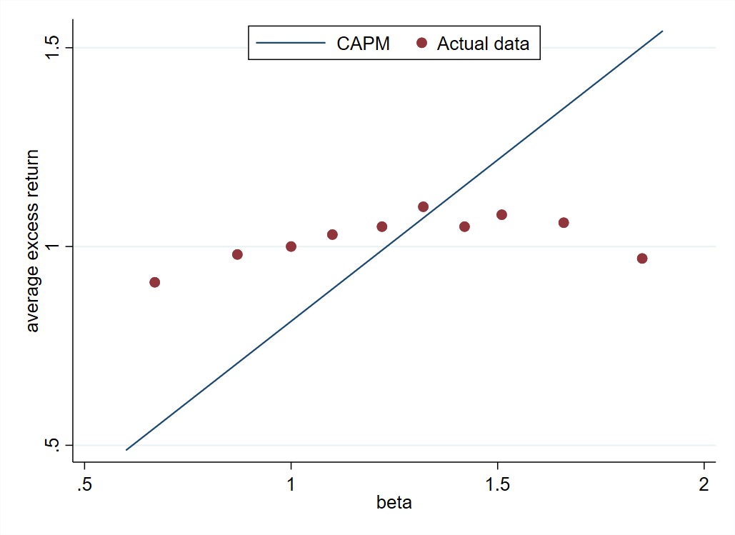
The red dots on the figure are the actual stock returns. They are constructed using return data for all stocks traded in the US, which are grouped into ten portfolios based on their beta. Each red dot is one these ten beta-sorted portfolios.
The red dots depict an upward slopping security market line, so stocks with a higher beta earn higher returns on average, but the relation is much weaker than predicted by the CAPM. The actual security market line is much flatter than in the CAPM.
How to interpret the discrepancy between the theory and market data?
There are two interpretations of that discrepancy. The first one is that stocks are correctly priced by the market and the CAPM is wrong. The CAPM could be wrong if its assumptions are not satisfied in reality. For instance, people may fear tail risk more than the CAPM assumes.
The second interpretation is just the opposite: the CAPM is right and stocks are mispriced in the market. For instance, stock market investors may fail to properly evaluate risk and overpay for high beta stocks. Overpaying for high beta stocks means that their return will be low, explaining why the red dots are below the blue line in the high beta region of the graph.
Finding out which interpretation is the right one is an active area of research. It matters for capital budgeting decisions. If markets are right, we should value projects using the discount rate implied by the flattish security market line, whereas if markets are inefficient, we should value projects using the discount rate implied by the CAPM.
Most chief financial officers and investment bankers use the CAPM to value investment projects. In the next post, we will see what happens when the CAPM-based valuation and the market-based valuation collide in an M&A transaction.
Source: The graph in this post is based on data from Frazzini and Pedersen, 2014, "Betting Against Beta," Journal of Financial Economics [pdf]
Posts on related topics